
Mockups before code
When you ask an AI assistant for a feature, you get it fast. That’s the good news. The bad news is that you often get a feature that works and isn’t the one you wanted, and by then it’s written, tested and sitting in a pull request. Deleting a finished feature feels worse than never having built it, so you end up taking it and tweaking.
I build Back & Forth with Claude Code, and I kept running into this. So I changed one thing about how I work: no code until I’ve looked at pictures. The pictures turned out to be useful by themselves, but the part I didn’t expect was how much of the process ended up written down somewhere the assistant reads every time.
The rule
Claude Code can keep notes about a project: a folder of small markdown files, plus an index that’s loaded at the start of every session. When I tell it how I want to work, it can save that, so I don’t have to say it again next week. Here’s the first one it saved for this, trimmed a little:
---
name: mockups-before-feature-work
description: Before building any feature or UX change, show mockups of
  the whole flow and get approval
---

For feature changes, show UX/UI mockups and get the user's go-ahead
before writing any code. Mock the general flow, not only the screens
that change: what leads into the change, the changed screens and states
(errors, empty, loading where it matters), and where the user ends up
afterwards. Cover web and iOS when both are affected.

Why: The user wants to judge the experience end to end and redirect
early, before implementation effort is spent.
Two parts of that matter more than they look. “The whole flow” stops it from drawing only the screen that changes. A new button is easy to judge on its own, and it’s the screen before it and the one after it where things go wrong. And “why” gives the assistant something to reason from when a situation isn’t covered. It says what I’m protecting, which is my chance to redirect before effort is spent.
What a mockup is here
It’s a single HTML file. No design tool, no handoff. The assistant reads the real screens and styles in the repo, then draws the new flow as plain HTML and CSS using the same colors and fonts, and I look at the rendered picture. It also puts the open questions at the bottom, each with a recommended answer, so approving is usually one line: “go with the recommendations,” or “recommended, except the second one.”
There are 26 of these pages in the repo now, committed over four days. They’re cheap enough to throw away, which is the point. For the iOS home screen I asked for four directions, drew them side by side with the same sample data, and picked one.
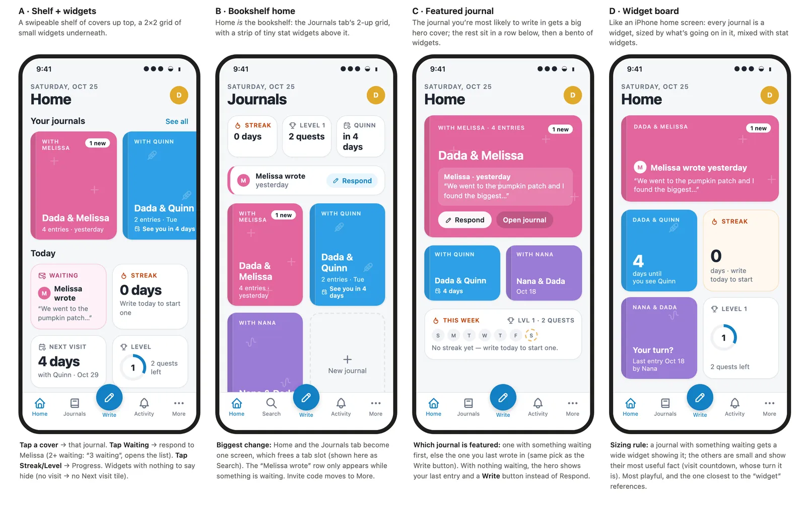
My wife and I looked at those and picked B, the one where Home is just the bookshelf of journals. We also dropped the streak counter from Home while we were at it, because a big “0 days” on the first screen discourages more than it motivates. That’s the kind of call that’s much cheaper to make in a picture.
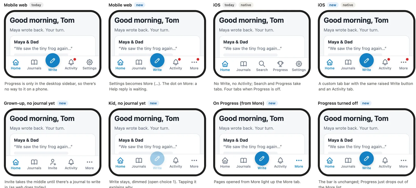
The bottom navigation was a different kind of question. The mobile web bar and the iOS bar had drifted apart, and I wanted one. The mockup shows twelve states of it, including dark mode, a grown-up with no journal yet, and a kid with no journal yet. Drawing that last one is how I found out the Write button needed a decision: a kid can’t write until a parent sets up a journal, so should it disappear, or stay and explain itself? Dimmed and tappable, with an explanation, was my answer, and I made that call looking at a picture instead of reading a bug report.
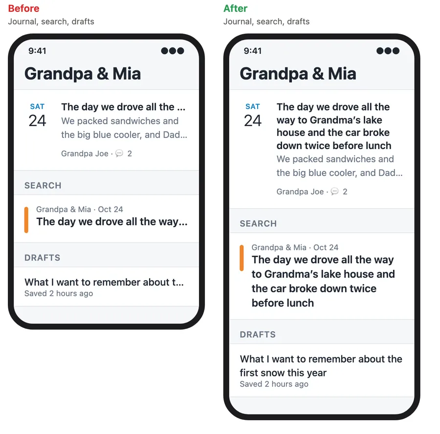
Even small changes get one. Long entry titles were being cut off at one line in three lists. The mockup is a before and after, and what I approved was “wrap in full, no line cap,” which I might not have chosen if I’d just been told it was fixed.
The second rule
A mockup only helps if what gets built matches it. On the Home redesign it didn’t quite. The assistant used the app’s existing illustrations and added pink washes and per-journal tints that weren’t in the drawing, and I asked it to take them out. Nobody was careless. It’s reasonable to think “this would look nice here.” But the mockup is what my wife and I approved, so anything that differs from it hasn’t been approved.
So that went in the notes too:
When building from an approved mockup, match it exactly: copy its
drawings, colors and wording into the code. Don't substitute the app's
existing illustrations or add accents that weren't in the mockup.

Why: the mockup is the spec. Anything that differs hasn't been approved.
How to apply: port the mockup's markup directly where you can. For
states the mockup didn't show, stay in its palette, and say in the PR
what was extrapolated.
The last sentence does a lot of the work. The assistant is allowed to guess, as long as it tells me what it guessed. Real builds do drift, and I’d rather read “the web tooltip sits above the chip, since the band clips anything below it” in a PR than find it later.
The rules that grew around it
I didn’t plan the rest of the notes. They piled up because something went wrong, I mentioned it once, and it got written down:
- Mockups go in the pull request. The first version of this was a link in the description. Then I wanted the final images embedded, so the notes say to render each mockup to a PNG with Playwright and commit it. The repo is private, so the usual
raw.githubusercontent.comimage links return 404. The fix, found the hard way on one PR, is a link to the file at a specific commit, which uses my GitHub sign-in and keeps working after the branch is deleted. - Run Prettier on the HTML too. CI checks formatting across the whole repo, and the commit hook skips
.htmlfiles. A PR failed on exactly that, on the mockup files nobody had formatted. Now it’s a line in the notes. - Name files
<issue>-<slug>. That’s what lets a script build an index page of every mockup, grouped by issue. - Keep the help articles in sync. Not a mockup rule, but the same pattern: the in-app help had drifted from the screens, I said so, and now any feature change updates the articles in the same PR.
- The gallery rule changed. I first asked for the screenshot gallery to be re-run with every UI change. A day later that was slowing everything down, so the note was rewritten to say “keep the capture list current, but only run it when asked.”
Looking at that list, a few of them are corrections of corrections. The notes aren’t a design that I wrote carefully up front. They’re a record of friction, which is a better thing for them to be.
A private place to look at them
The mockups needed somewhere to live that I could share with my wife without making them public, since they show unreleased screens. GitHub Pages can restrict access, but only on Enterprise plans, and the repo is on a personal account. So the mockups folder is served by a small Cloudflare Worker that’s just static files, with Cloudflare Access in front of it. A script builds an index listing every mockup newest first, and each pull request that touches the folder gets its own preview URL.
What it did
I can’t give you a clean number for this, because I don’t know how many wrong features I would have built otherwise. Here’s what I can say from the repo:
- 27 of about 120 pull requests embed a mockup, and most of the larger features have one.
- Approvals carry decisions. The notes for each feature record what I approved, usually along the lines of “approved as drawn, with the recommended answer to every open choice.” When I review the work later, I’m checking it against a record instead of my memory.
- Review feedback lands earlier. On the screen for reporting a problem, I looked at the mockup and asked for the form to sit above my list of past requests, since on iOS it was buried. That went into the same PR, which is cheaper than a separate issue later.
- The decisions that matter get made in a picture. Dimmed Write, wrap in full, no streak on Home. None of these are hard, and none would have come up if I’d asked for the code first.
It isn’t foolproof. A mockup is HTML, and the real screen is React Native or a web component, and they disagree in small ways: a clipped tooltip, a prompt that fills in a title the mockup left empty. I try to check the real thing on a phone, and several of my notes say “iOS not checked by hand” where I haven’t. And the notes can go stale. Some of mine say “worktree removed” about work that finished weeks ago, and they only help if the assistant reads them and I keep them honest.
If you want to try this
You don’t need my setup. Three things carry over:
- Write the rule down where the assistant will see it again. Explaining your process every session is how it stops getting followed. Include the why, since that’s what lets it handle cases you didn’t think of.
- Make the pictures cheap. If mockups are expensive, you’ll skip them for the small stuff, and that’s where the surprises are. HTML files drawn from the real styles are about as cheap as it gets.
- Treat the approval as the spec. Otherwise the mockup becomes a suggestion, and you’re back to reviewing code to find out what got built.
What I like most is where my effort goes now. The assistant writes the code, and I spend my time on the part where changing my mind is still free.